Peace of Mind
Summary
Peace of Mind is a meditation app where users can customize their own meditation sessions. This app is designed to motivate people to meditate and maintain to their meditation habits.
My Role
Tools Utilized
Figma
Pen & Paper
UX/UI Designer
UX research
Qualitative Interviews
User flows
Wireframes
Visual Designs
Branding
Qualitative Usability Testing
Quantitative Usability Testing
Prototyping
Persona Development
Project Length: April - June 2022
Team size: 1 - UX/UI Designer
Understanding the Problem
Meditation has many benefits for us. Meditating helps us to gain a new perspective on stressful situations, increase self-awareness, reduce negative emotions, focus on the present, practice patience and empathy, etc.
As a person that has always known about the benefits of meditation, I struggle a lot with trying to keep up with my meditation habits. I have tried meditating before with meditation apps and couldn’t quite find the balance between feeling encouraged and feeling discouraged or guilty for not hitting my milestones. That is why I want to create a meditation platform that motivates people to maintain their meditation routines and prioritize users’ actions more than their achievements.
Competitive Analysis
The first step I took for this project is to do deep research in order to understand the user of meditation apps and the challenges that come with their current versions.
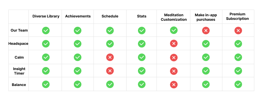
I found that there are many great meditation apps on the market, and the similarity they all have is having a wide range of meditation topics for users to choose from. Though these apps have a wide range of meditation topics and great UI designs, they didn’t have options where users can customize their routines. When users are motivated to actually complete their meditation sessions are the achievements and the statistics of their meditation progress.
Most of these apps have premium subscriptions which allows users to have access to more of their meditation contents, meditation plans, … Headspace doesn’t have any free contents for users but allow users to browse through their apps.
User Interviews
Before scheduling my user interviews, I spent time organizing my discussion guide to prepare for my 1:1 interview. My discussion guide includes questions about users’ backgrounds, routines, opinions on the current app (if they are using a meditation app), their opinions on their likes and dislikes, and their motivations and avolition.
In this process, I spent 1:1 time interviewing 3 people. Based on their responses, here are the key findings:
All 3 of them are in the early stage of their careers. The reason why they start meditating is to relax and destress that they had from work.
1 out of 3 started meditating a year ago and stopped meditating because lack of patience and a busy schedule
2 out of 3 are still meditating, they are at the early stage of their meditation journey. One started about 6 months ago and the other person started a year ago.
Their motivation for meditation is to have an easy meditation app to use. 1 out of 3 uses Headspace and the others use the Youtube platform. People that watch meditation content on Youtube usually go back to watching the same video or have their own playlist. The person that uses Headspace, prefers the app because it has short sessions and great recommendations to adjust to her busy schedule.
Overall, these key findings have given more understanding of why maintaining a meditation routine is a challenge for some people.
Synthesizing the Data
After going through all my research data, I wanted to include the customization features and progress tracking, and I want to be able to help them overcome the obstacles they might face in their way of creating a healthy meditation routine. I want this app to be able to encourage them to prioritize to take action.
List of things that might make people feel discouraged:
Unrealistic Expectation
Ad Clutters
Poor Onboarding Experience
Constant Spam Notification
List of things that might make people feel encouraged:
Realistic Goal
Help people to achieve their goals at their own pace
Persona Development


Feature Research
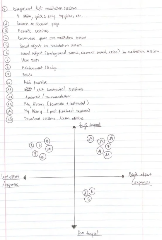
The exercises 2x2 matrix, task analysis, and how might we statements were important to complete before moving on to the process where I would create user flow and sketches. This process helps me to understand which features should be prioritized more.
2x2 Matrix
The 2x2 matrix exercise helped me to determine which features are going to help our users easily use our apps. The features I want to be focusing on are mainly low effort + high impact and high effort + high impact. What I want to avoid is creating features that lie within low impact + high effort. This means that the features are more complicated and require more work than the results they produce.
Task Analysis
The Task Analysis exercise helps me understand how many steps it would take to complete the task. In this task analysis, I chose to focus on the user meditation stats system. I would focus on presenting the data of the users based on their time meditating on the app and outside the app (users can add their meditation sessions to the system). The app could also have a points system for users, the more frequently they follow their routines each week, the more points they have. This means they can unlock premium content without actually paying our subscription fee.

How Might We
HMW Statements exercise helps me to understand how can I help our users to achieve their goals.
How might we help people find customizable experiences that steepen their growth trajectory?
How might we create more opportunities for people to expand their knowledge in the unfamiliar subject matter?
How might we encourage people to achieve their goals without making them feel guilty or bad for missing their routines/plans?
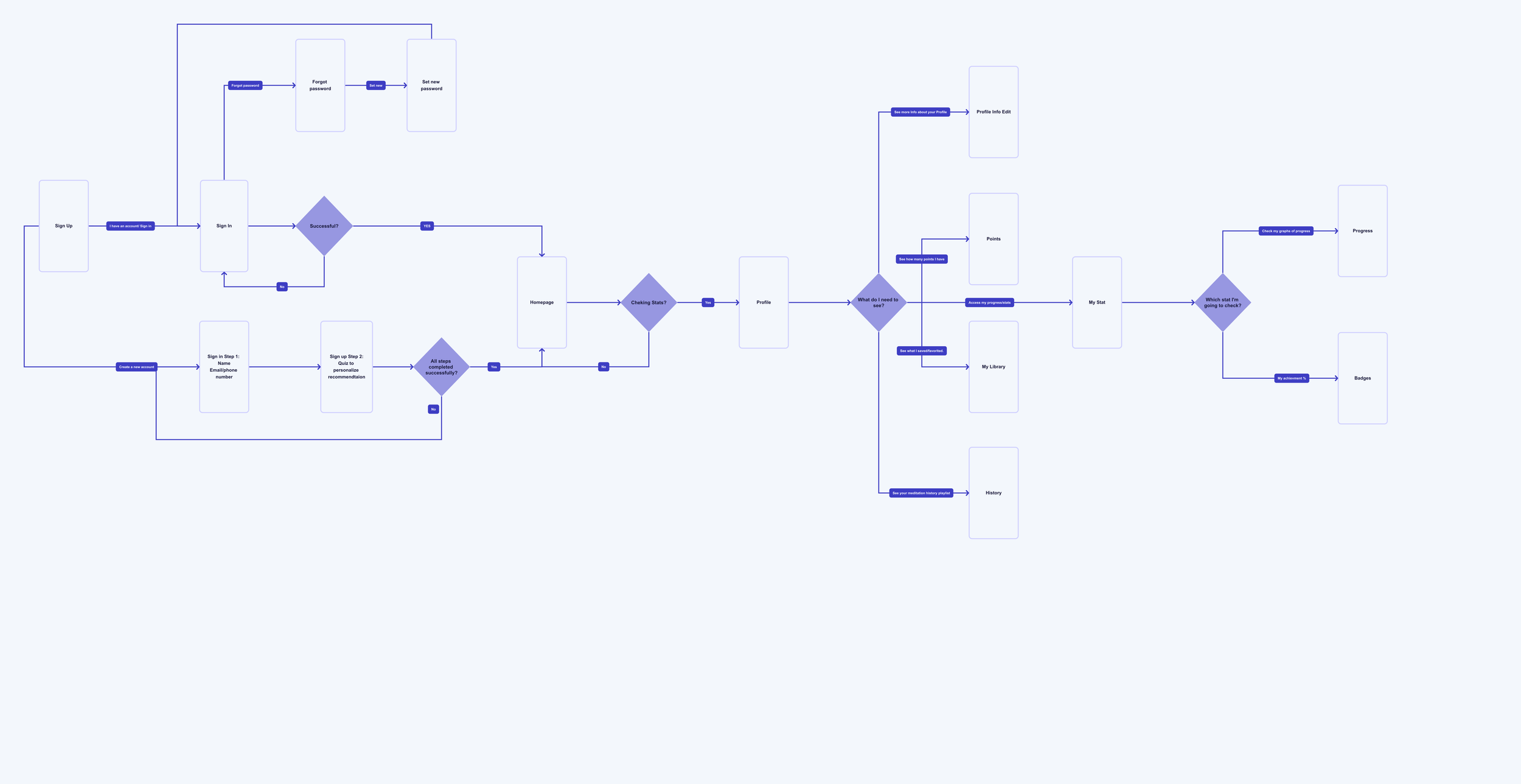
User Flow
I created a user flow to understand the steps a user would take through the entire process of starting the app to exploring every content or page that is available on the app.
Sketching
Using the user flow, I began to sketch the app screens in sections. This sketching process helps to me discover ideas for how the app will turn out.


Wireframes
After sketching, I created a clickable wireframes and use it to conduct first usability testing for this project.
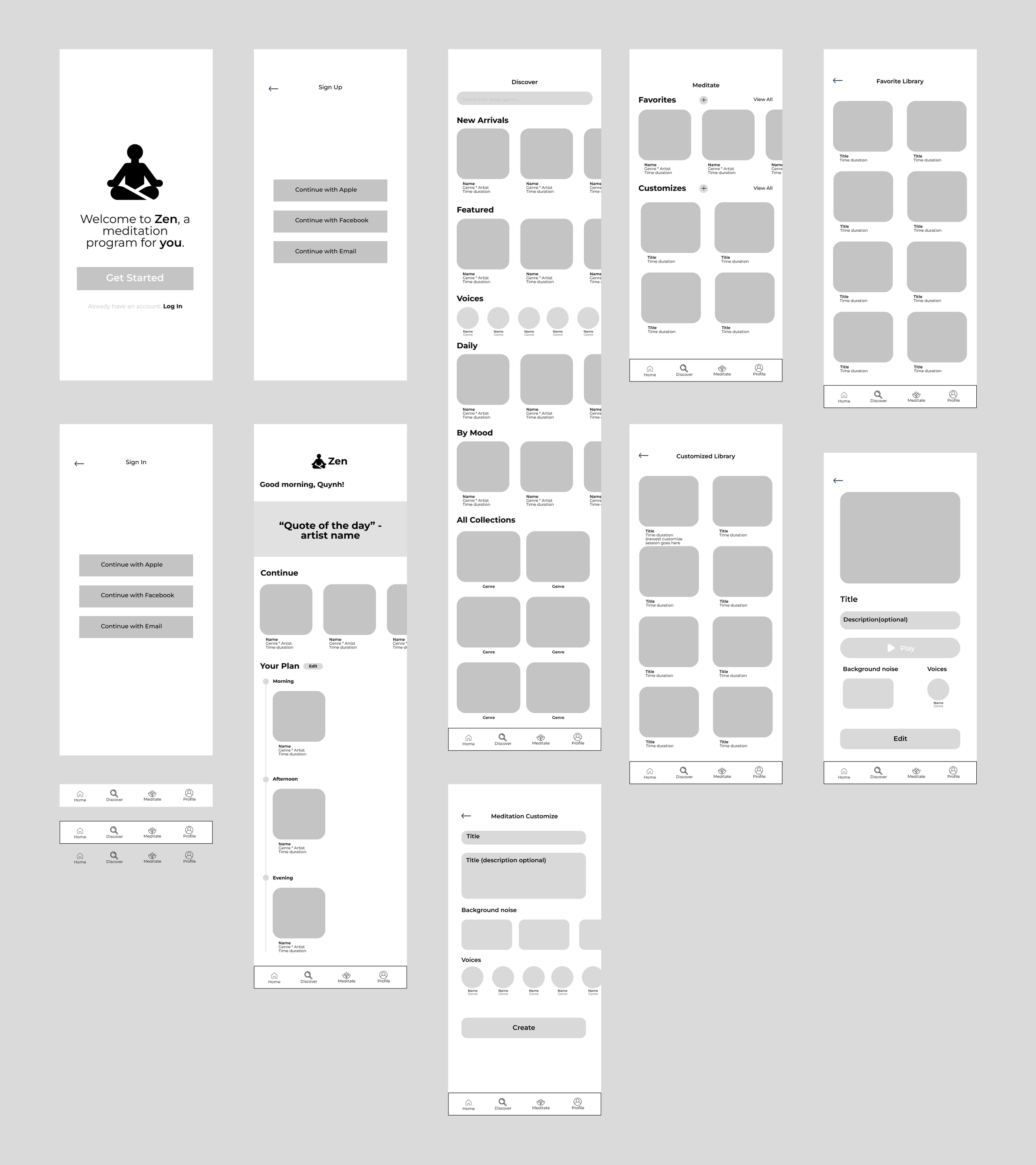
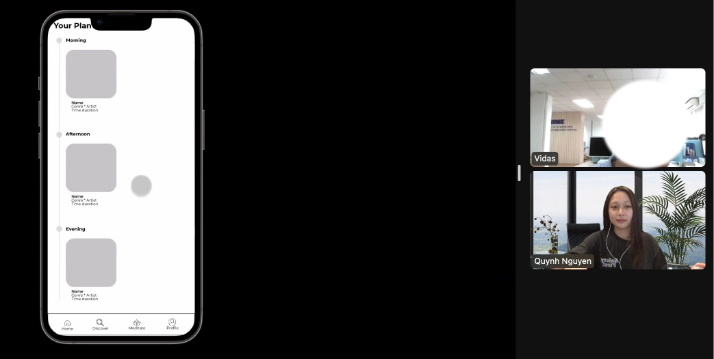
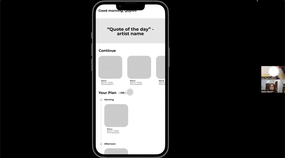
Usability Test #1
For the first usability test, I conducted the test with 3 people. I created the clickable wireframes with Figma. The method I chose to conduct the usability test is to send the testers the Figma prototype link, and asked them to share their screen while completing their task.
Feedback
Ting - Ting’s feedback was straightforward. She suggested that on the customization page, users should be able to see the title of what they are typing in. For example, on the customization page, I did not include the title of the space where users type in the title they want for their meditation session. Ting mentioned that lots of times when she’s using an app, it requires her to type something, and she often forgets what she is doing on the app so labeling
sections would help to remind users of their purpose.
LP - LP’s feedback was very helpful. First, she was quite impressed with what I have so far as a low-fidelity prototype. She was confused about the contents I included in the app and suggest that I should set the font size a bit bigger. She also suggests that creating a quiz or a poll for users to get their profile recommendations before signing up would help narrow down what to include on the homepage, discover, and Meditate.
Vu - Vu’s feedback was very helpful. He was impressed with the low-fidelity prototype. He suggests that the menu navigation should always stay at the bottom of the phone screen instead of users having to scroll all the way down to see the hidden menu navigation.
Conclusion
I realized that the app is lack repetition and alignment. Through the feedback, I can understand how users struggle to navigate. Pages such as the homepage, discover and meditate need to have the same grid system or better spacing between sections and meditation sessions. I also need to redesign the contents I want to include in the app. I’m planning to do more usability tests later on next week where I can have the fully functional prototype of the app with 50% of the UI done.
Lo-fidelity Designs
After going through the feedbacks from my usability test #1, I decided to make some UI changes to the app screens. For this lo-fidelity designs, I added more space between meditation blocks and bigger font size for users to view the contents better. I also changed the navigation menu for users to easily navigate. The previous navigation menu was too small and it didn’t show completely on the screens.

High-fidelity Designs
During the process of design high-fidelity designs, I struggles with finding the right color palette and how to position buttons. I then had a discussions with my GA instructor. The feedback I got from him is to go on Adobe colors or Coolors to find a palette that can inspire me to create for this project. He also mentioned that the current color palette is quite bright, the font sizes are too small, and need more spacing between app contents.
I took his advices and made changes to the look of the app.

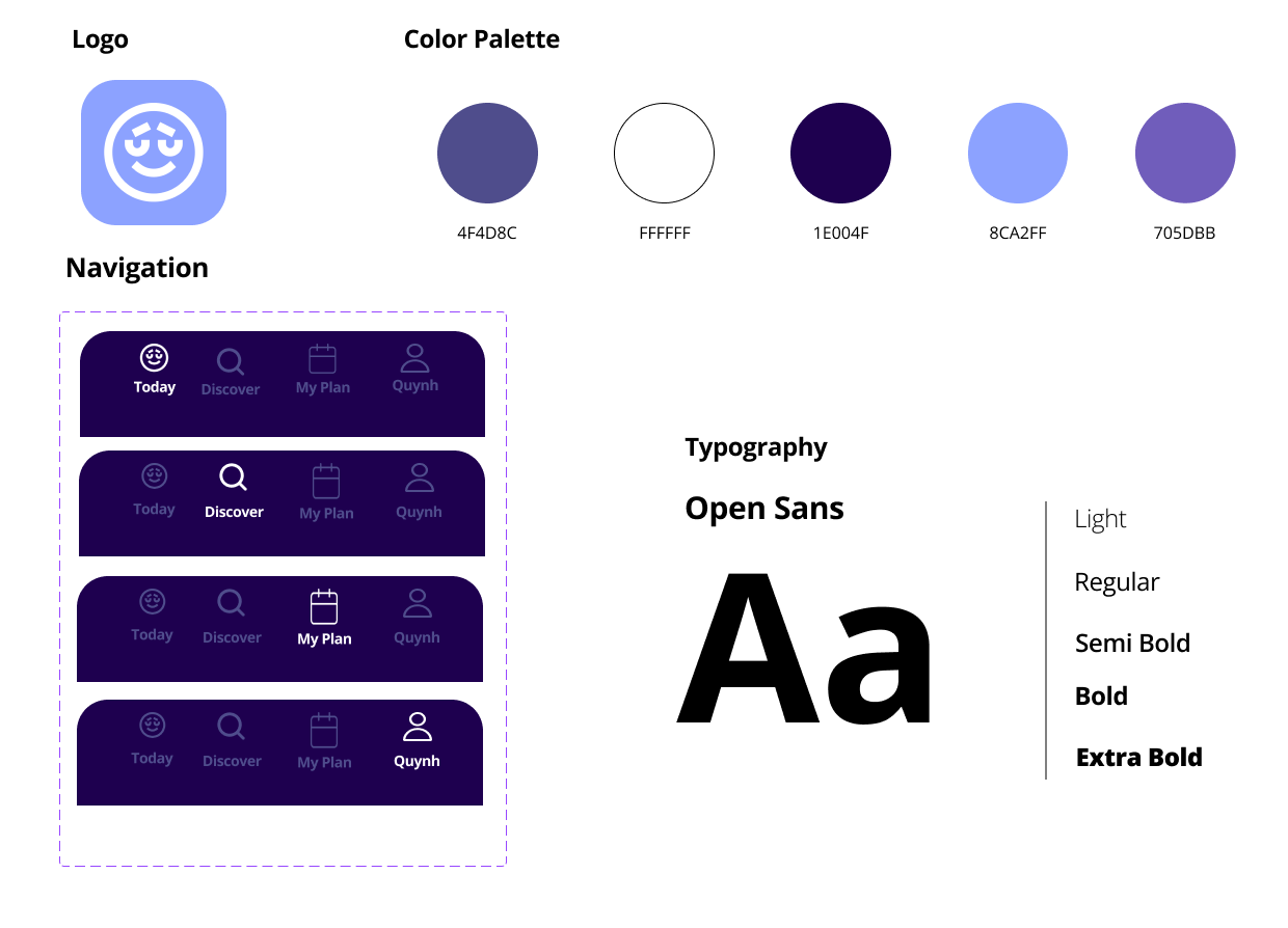
Style Guide
Usability Test #2
For usability test #2, I create a prototype test on MAZE.
6 responses, 5 blocks.
Most of my users meditate once a week or never.
The task was to find a way to edit their current meditation plan. The success rate is 66.7% which is still relatively low.
They expect everything to be clickable.
Conclusion: Next step is to go back and improve the interaction. I also want to focus on making it easier to customize. I think I include too much information on the screen, which might frustrate users in understanding this customization system. For the next design process, I’m going back to recreate the user flow specifically for the customization system and re-sketch the screens.
Userflow #2
For this process, I combined the feedback I got from my 2 usability tests, and resulted that my previous customization system was including too much information on one page. I created a user flow to understand the steps of a user would take through the entire process of customizing their own meditation plan. The flow begins when a new user/not logged-in user opens the app and finishes when they are done customizing their plan. I decided to have two main paths when users start to customize their meditation plans.
The first path is to manually choose the sessions they want to include in their meditation plan. The second path is to let our system choose for you based on the topics you are interested in and your preferred meditation session duration.
I believe with this method, it will allow our main personas to choose whichever paths they are comfortable with. For example, Dennis - a beginner in meditation will likely choose the second path. He is still in the exploration state and would want to try out many meditation sessions before forming his own plan/schedule. For Mai - intermediate in meditation will likely choose the first path where she can manually choose her sessions and plan her routines throughout the week.
Sketch #2
After creating the user flow, I began sketching for the steps of meditation plan customization. Again, this process helps me to iterate and see the potentials of how the screens would roughly look like.


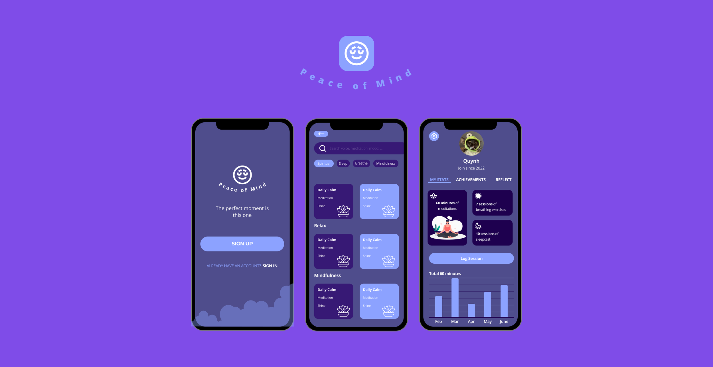
Final Prototype
The high-fidelity designs and prototypes were created by me with the help of my General Assembly instructor. I wanted to take a more calming and dark-tone approach to the styling of the app. I also want to keep it minimalistic.
All elements in the app including the navigation, buttons, and icons were created as components in Figma. I also created the designs and the prototype in Figma.
Here is the complete High-fidelity Designs of Peace of Mind
Try out the app yourself
Next Step
The app currently has all its completed designs and branding. The next step for Peace of Mind is to find a funder for the app. Then I would be able to recruit developers to develop the app. I would like to test the app with more people from different backgrounds. I want to understand how our users are interacting with the application. The more feedback we get, the more improvements we can create for our users.
Learning Points
This project has been a great learning experience for me from both research and visual design perspectives. I completed this project as my final project for the General Assembly UX Design Certificate but I never thought I would be able to create an entire design of a meditation app. After doing a good amount of research, conducting interviews, and usability tests, I learned a great deal about how to structure my interviews and tests for future projects. Before starting the certificate at GA, I never thought of creating a design system or a style guide. I spent a huge amount of time trying to figure out using Figma for this project. I am grateful for this learning experience and I hope to improve my skills more with future projects.
Thank you for taking the time to view Peace of Mind!