Payge
Summary
The Payge app is designed to help people that use digital wallet transfer funds quickly and without hesitation by relying on our trust rating system.
My Role
Project Length: June 2022 - February 2023
Team Size: 4
Adedayo - Developer
Duc Huy: Developer/Project Manager
Minh Quang: Data Scientist
Quynh: UX/UI Designer
Tools Utilized
Figma
Skills
UX research
User Interviews
User flows
Wireframes
Design system
Quantitative usability testing
Prototyping
Understanding the Problem
My first step in this project was to go over the previous prototype, and business model, and interview people on my team.
By interviewing my team, I found out these were their main concerns about the current version of Payge:
How can we improve the flow of the application?
Are all design elements responsive?
What features do we need to prioritize?
Research
Competitive Analysis
The first step in my research process for Payge is to do a competitive analysis of similar types of digital wallets that are currently in the market.
Of the similar types of digital wallets on the market, I found many differences between them but also many similarities. I noticed most of these products have been having scams happened on their platforms. Most of the customers would be able to get a refund of their money but they have to go through many stages with customer services. It could take up to 180 days for a customer to receive their money that they have reported sending to wrong person or being scammed.

Lots of digital wallet apps make it very easy for users to start transactions with someone online, even somebody that isn’t on the user’s contact list. None of them were able to be refunded immediately without contacting customer service. Customers can get easily frustrated with this type of problem-solving process. It takes time and effort for customers to get back their money for a small error.
Instead of solving this issue, most of these digital wallet apps continue to not improve their business model and simply warned users to check the information again before starting a transaction. Venmo is the only competitor trying to solve this problem on their end. Venmo has an option for its users to have buyer protection before purchasing or sending money on its platform. Though this is a great idea for each transaction to have Buyer Protection, they charge 1.9% out of the total amount to the seller which is a huge disadvantage to sellers.
As a result, this research gave us confidence that our idea was worth pursuing.
2x2 Matrix
We went over the data and prioritize the features of Payge through a 2x2 matrix exercise. Since many of the digital wallet apps we mentioned above were not focusing on solving the issue we are trying to solve.

User Flow
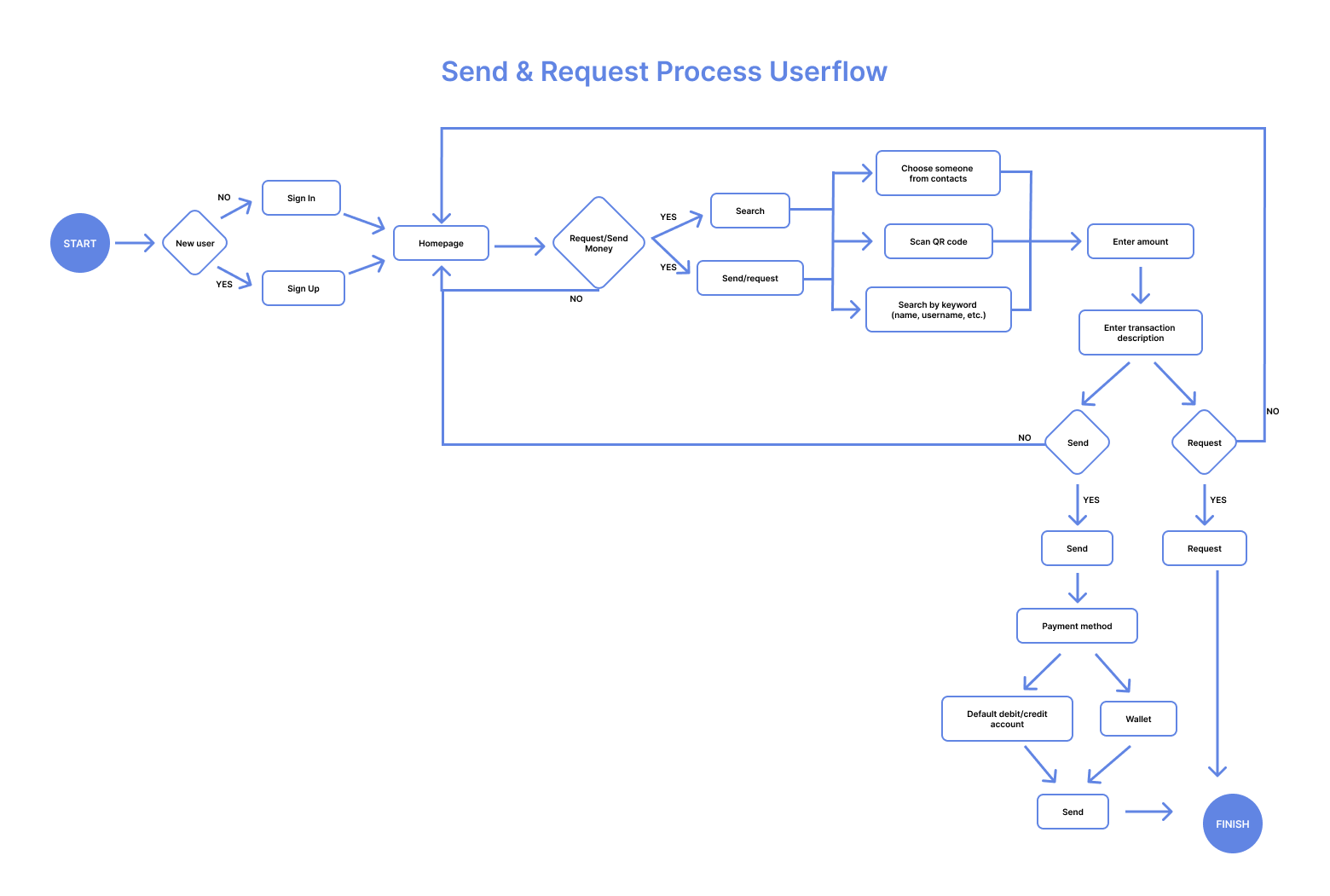
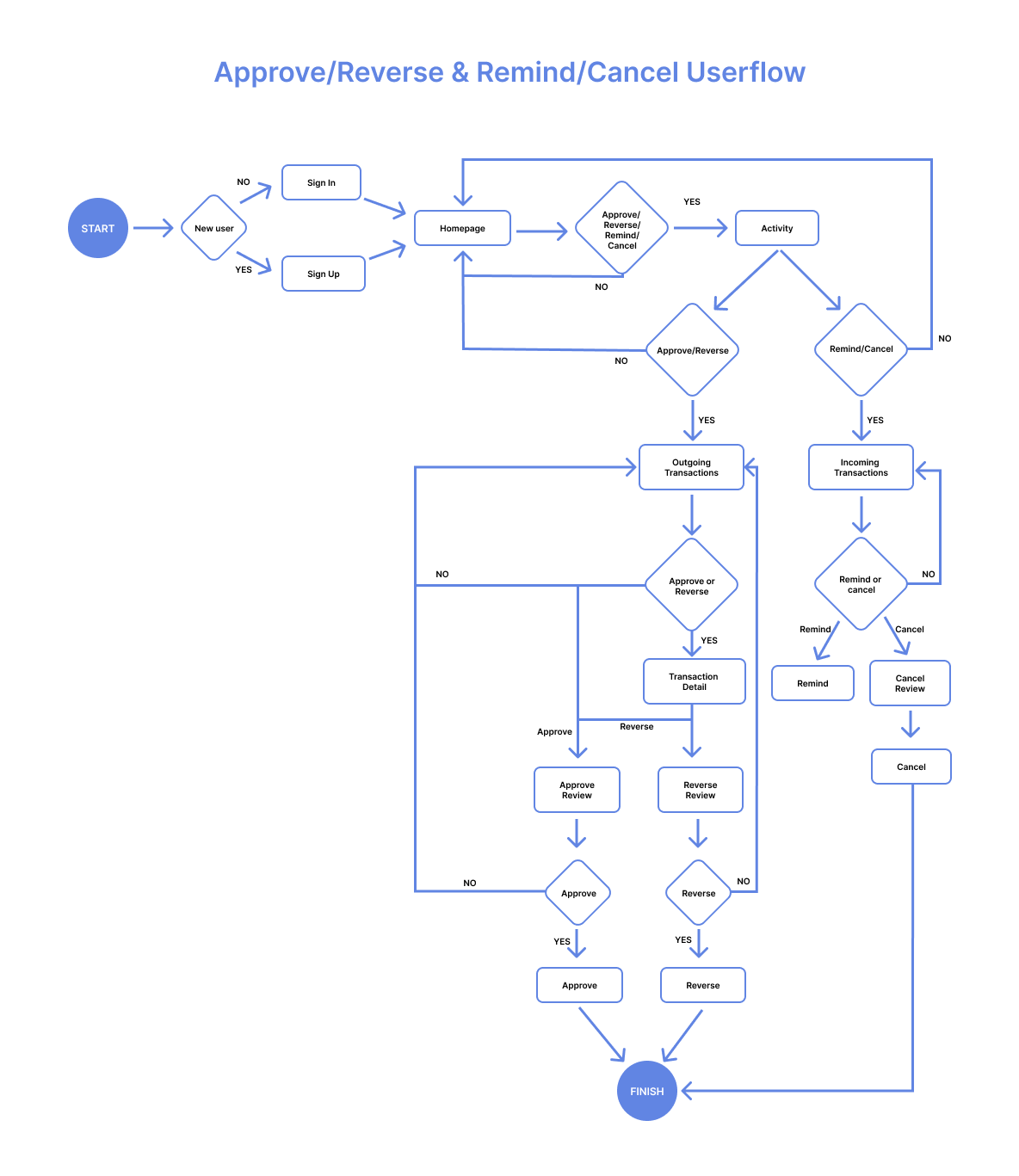
The next step is to create a user flow for Payge features. We had a few weekly meetings to go over the demo critiques. To understand better the current flow of the current version of Payge, I created a user flow that represents user interaction with the application and presented it to my team.
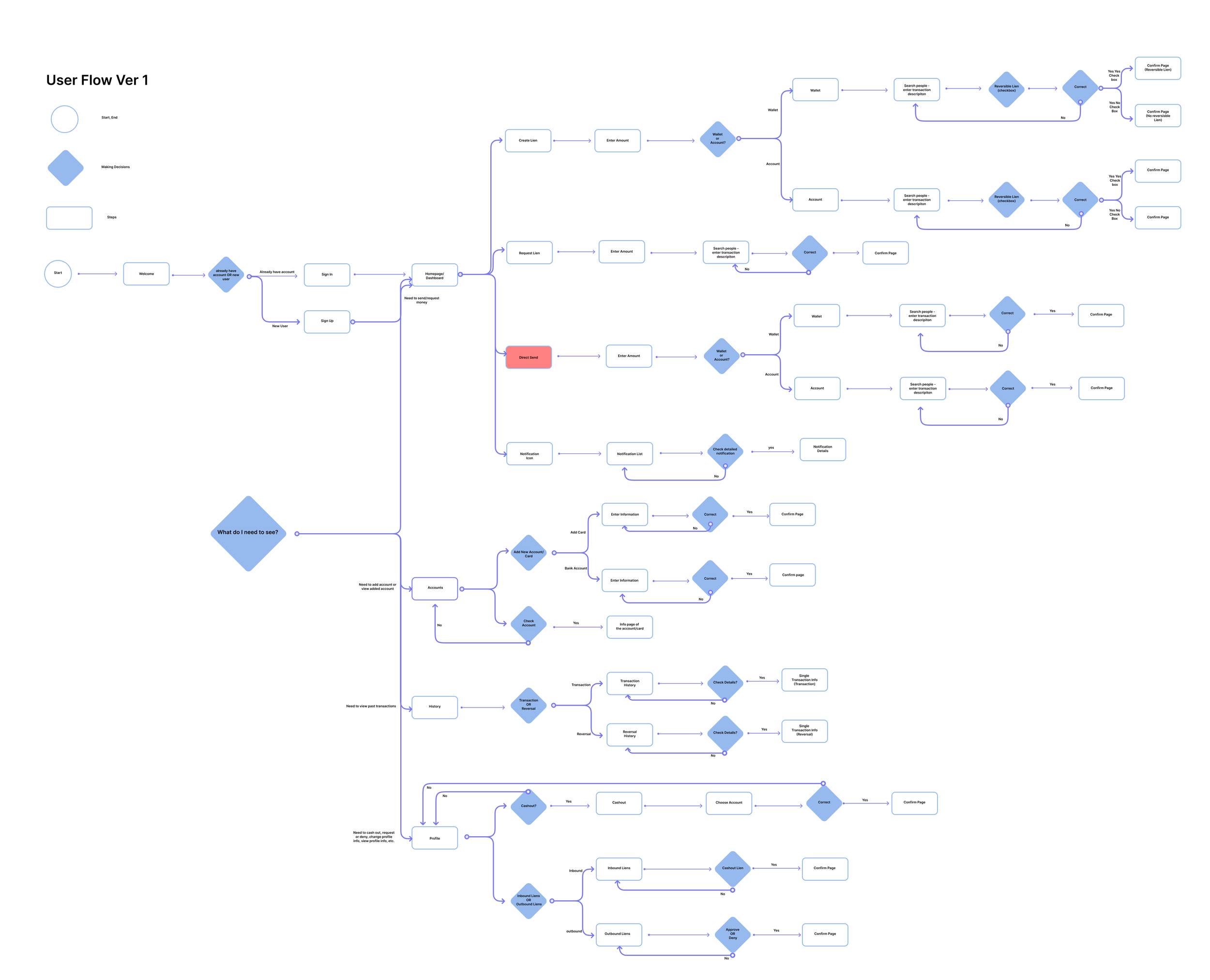
As a team, we decided that there were features that we want to change. These are two main changes we are making to the current demo of Payge.
Instead of having three main actions on the homepage, we chose to narrow it down to two which are send or request. This will be much simpler for our users to decide when opening Payge.
Instead of having History as one of the navigation, we chose to change history to activity. This will allow our users to approve or cancel/reverse ongoing transactions.
Below is Payge’s new user flows.
Sketching
Using the user flow I have included above, I began to sketch the app screens in sections. This sketching process helps me to discover ideas for how the app would roughly look like.
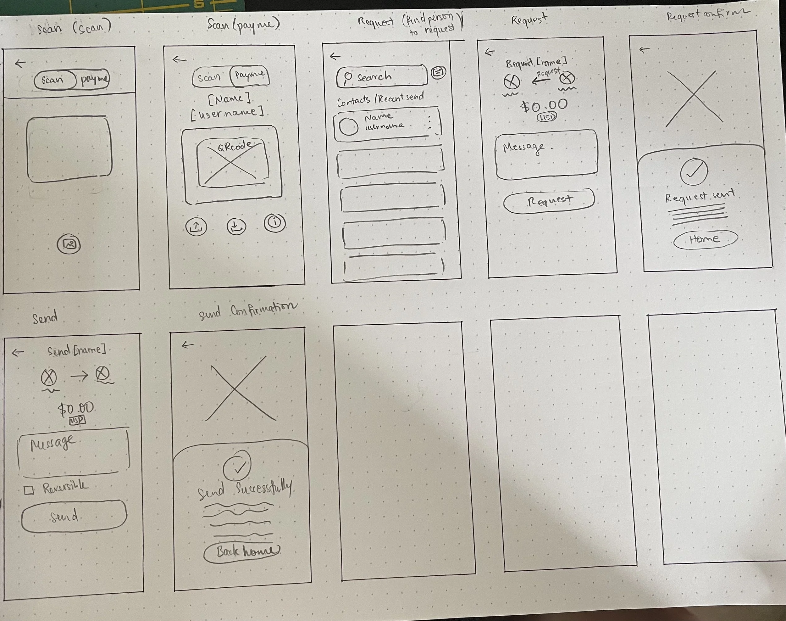
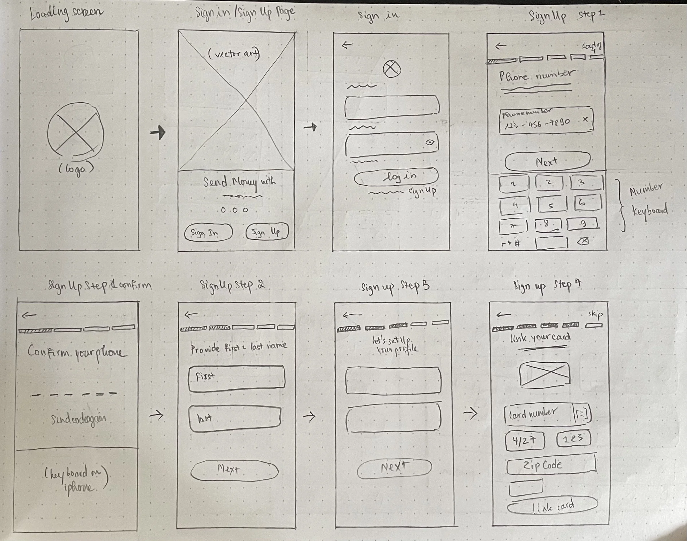
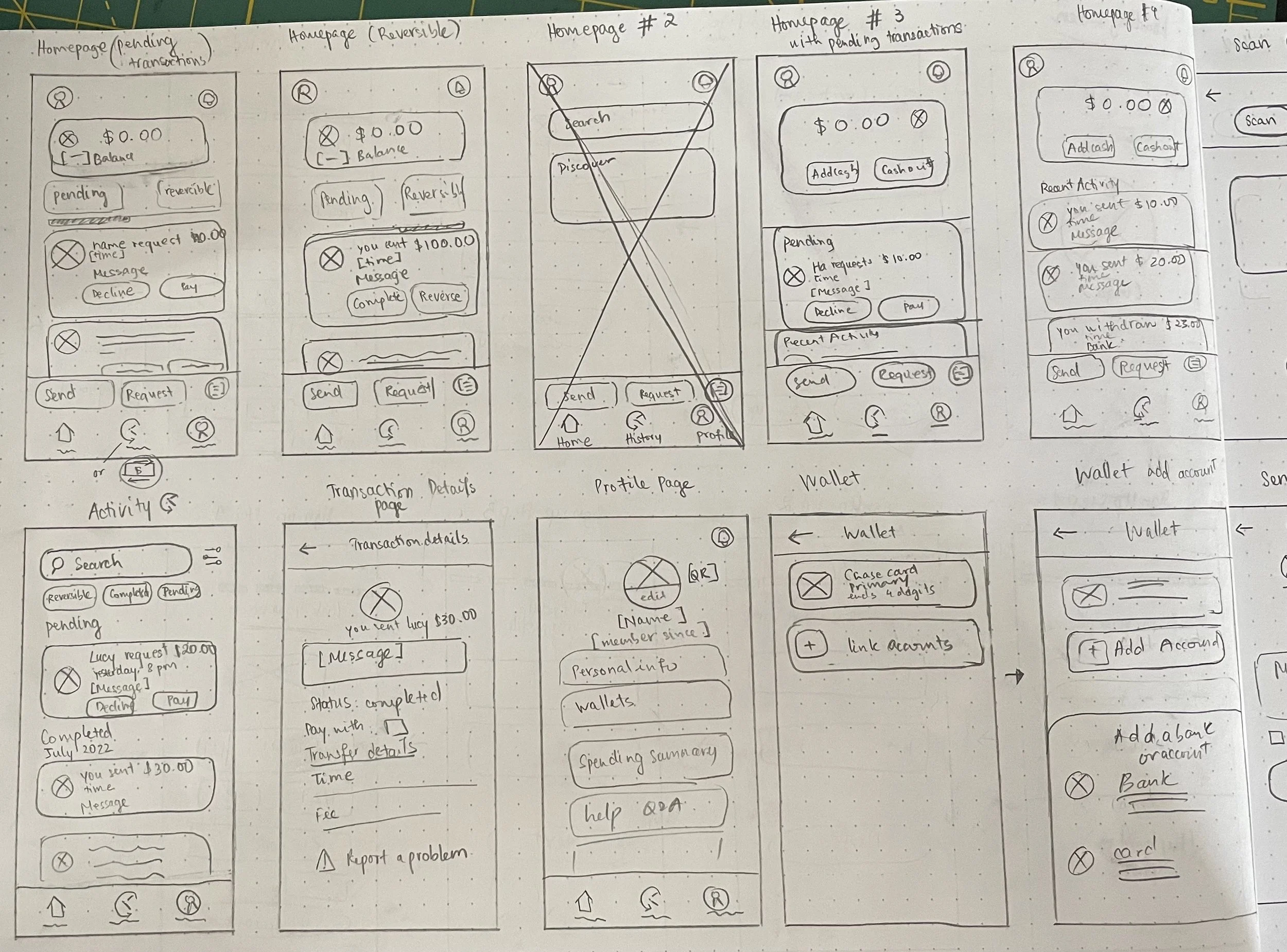
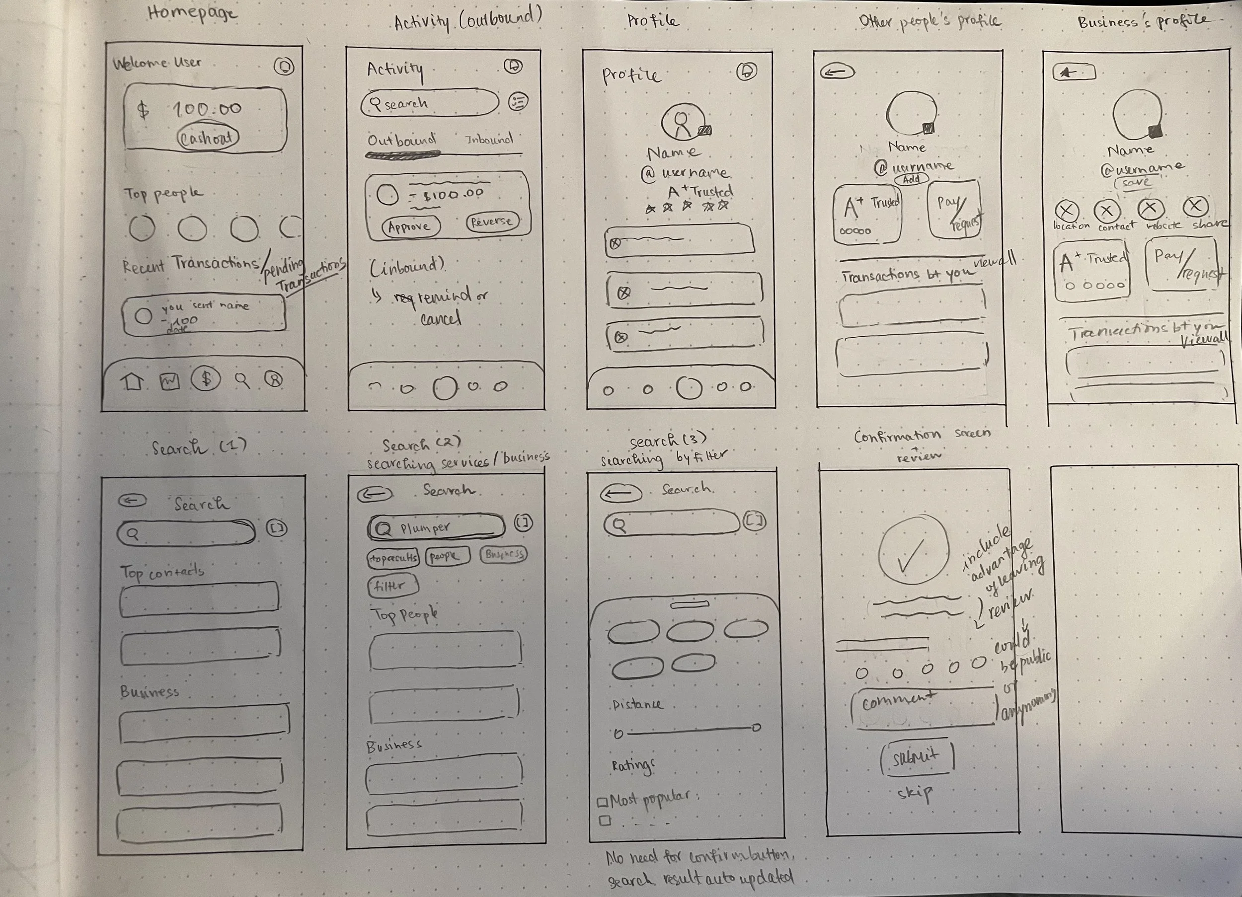
Wireframes
After sketching, we work as a team to create wireframes.
Low-fidelity Prototype
After reviewing the wireframes, I continued to create the lo-fi prototype. This prototype was used for Payge usability test.

Usability Testing
Our usability test was created on MAZE platform. In this usability test, we have 8 participants taking the usability test.
The method of conducting the usability test is to have a few questions about participants’ experience with digital wallet apps. After participants have answered questions, they are given tasks to complete which shows their interaction with our low-fidelity prototype.
We have three main tasks for our participants to complete.
Send money to Jane Doe.
Request money from Jane Doe.
Reverse a transaction you had with Jane Doe.
Based on the usability test’s report, the misclick rate for task 1 is 34.4%, task 2 is 22.5%, and task 3 is 0.0%. We were concerning our app flow isn’t working but we also kept in mind that the low-fidelity prototype includes a clickable navigation menu that explains our participants left the expected paths. Overall, all our participants completed all tasks successfully and our team is confident to move on to the next stage of Payge.
Design System
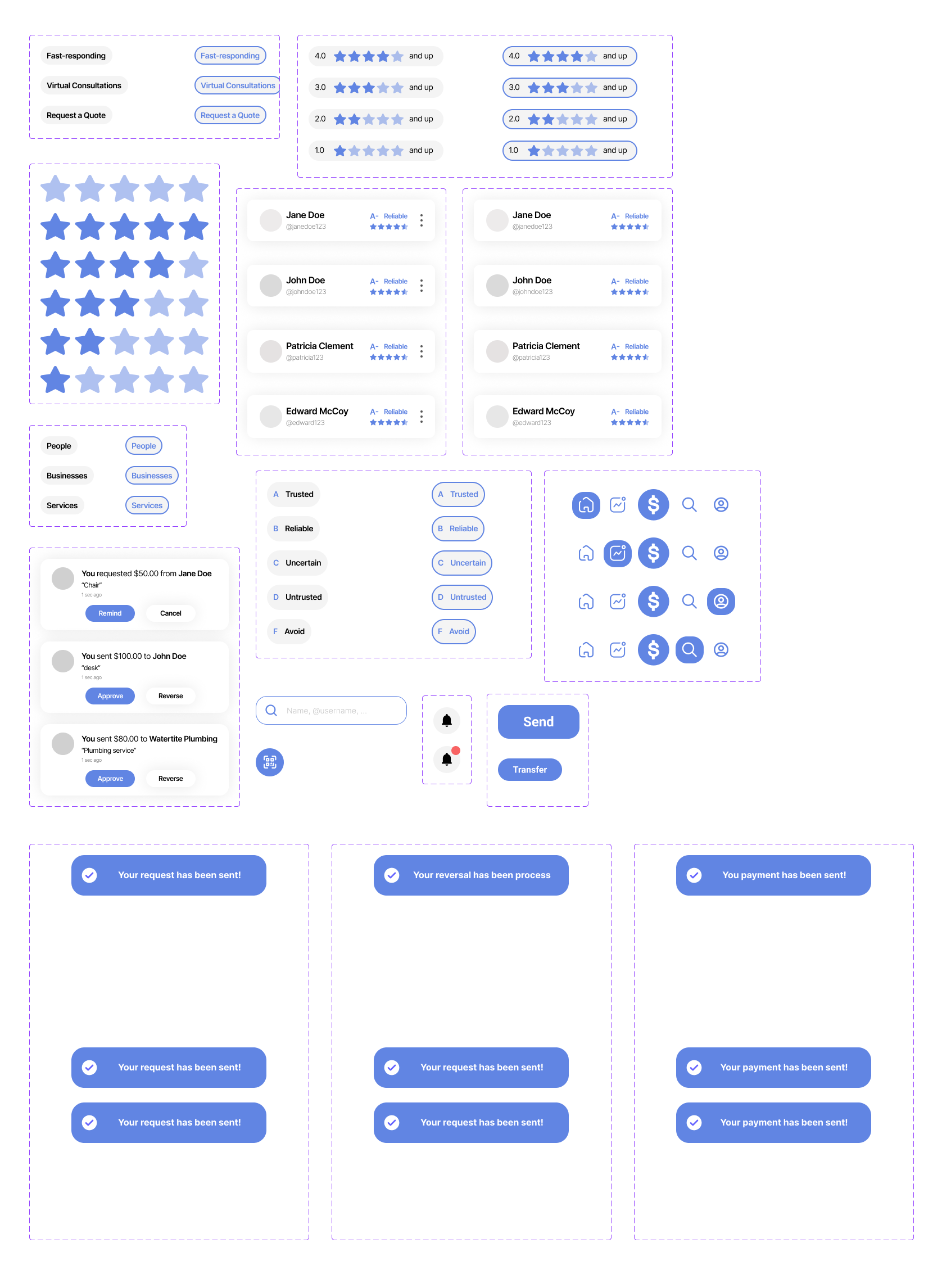
Payge is an app that could be updated to better versions in the future, we think creating a design system would be helpful for our future updates. All elements in the app including navigation, buttons, ratings, and icons were created as components in Figma.

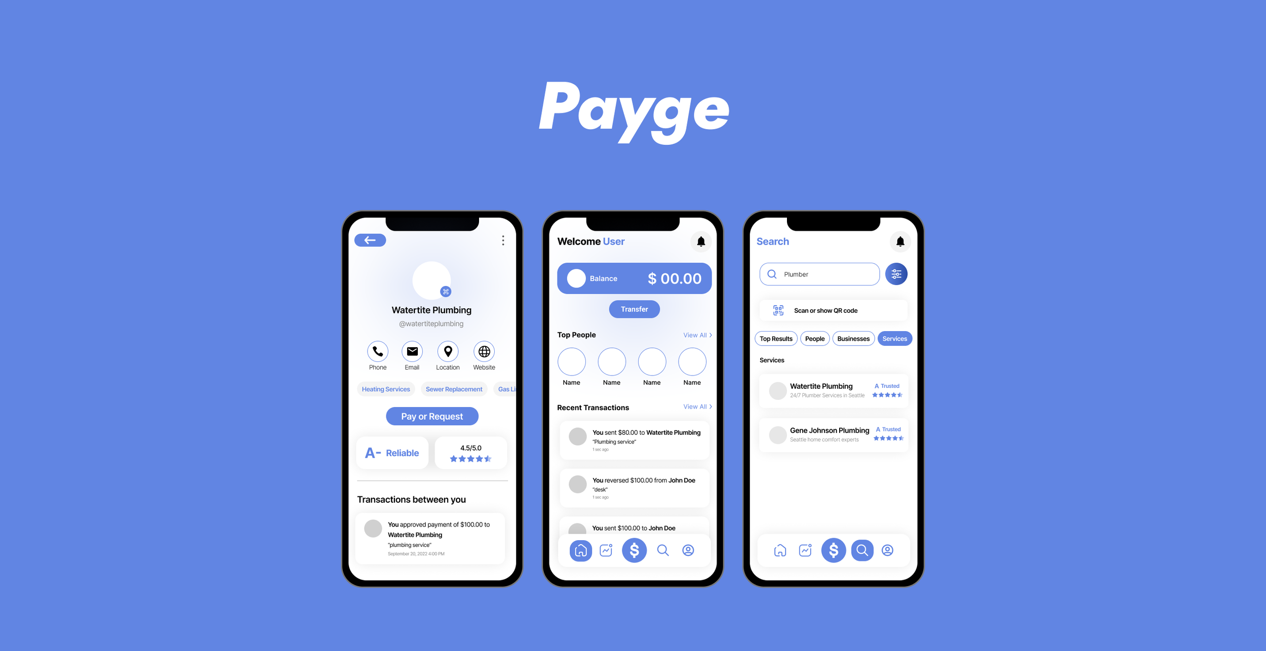
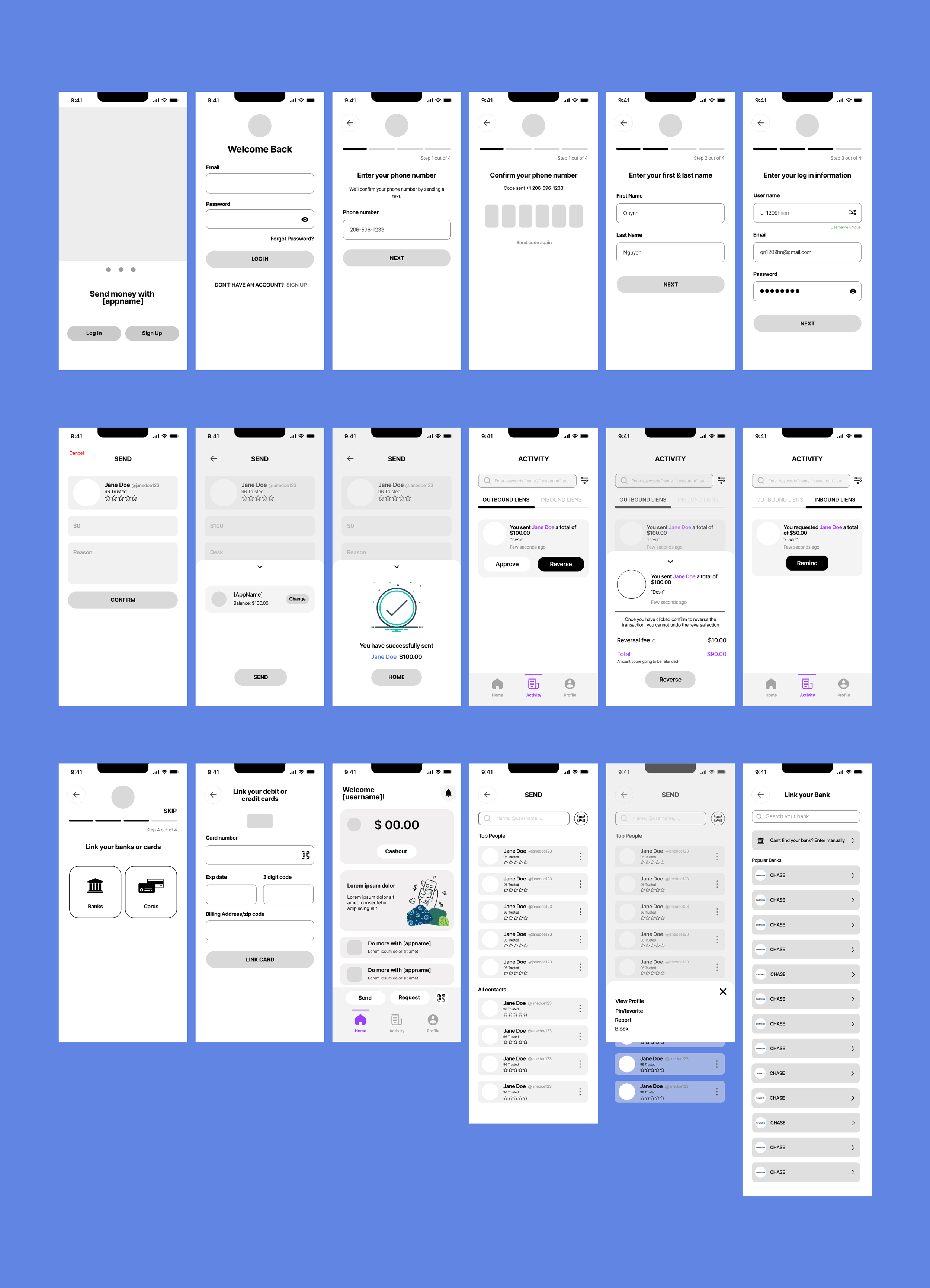
High-fidelity Designs and Prototype
The high-fidelity designs and prototypes were created in Figma. I wanted to take a modern approach to the look of the app as well as keep it minimalistic.
High-fidelity Designs

Prototype
Next Step
With the current stage of Payge, all designs are completed and our team’s developers are working on the skeleton of Payge. The next step for us is to host meetings to go over prototypes and work on collaborating together to create a working demo with the database.
Learning Points
This project has been a great learning experience for me from team collaboration, market research, and visual design perspectives. I never worked in a team as a UX/UI designer and this experience has given me opportunities to freely express my ideas and opinions to our team. I spent a great amount of time learning how to organize the design system of Payge. I am very grateful for this learning experience and I hope to continue contributing to this project.
There are some mistakes in the visual design aspect I wished I have noticed eae
Thank you for taking the time to view Payge!